During the two months before Thanksgiving, more than two trillion dollars were wiped off the S&P 500, dragged down by the technology giants whose stocks saw declines of 20 per cent or more. Until this week’s rebound, the index itself came close to being in ‘correction’ territory.

Although by many indicators a full-scale market rout may be overdue, October and November’s decline was something different. Correlations didn’t converge to one, and winners and losers could be categorised in several ways.
First of all, consider the sector story. Amid the $2 trillion of wealth destruction some sectors of the index performed well. Consumer goods stocks like McDonalds or Starbucks enjoyed double digit returns since September. Healthcare and utilities are other sectors with decent returns over this period.
The Risky Finance equity visualisation tool shows the cumulative cap-weighted returns for stocks in each sector over the last two months, and the effect is easy to see.
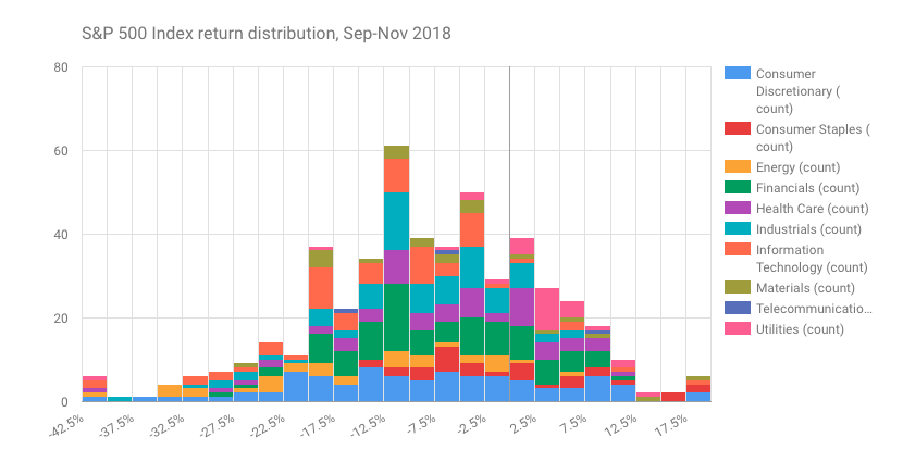
We can also see the same result as a histogram of returns, where the columns are the number of S&P 500 stocks with a return in a specific range. Here each sector is assigned a different colour. Technology stocks (in orange) are clustered over on the left (negative return) side of the chart, while consumer staples are mostly on the right.
There’s not only a sector story – there’s also a size story. We have been writing about gigantism in the S&P 500 for some time now, exploring theories and evidence on how size defeats everything in its path as an investing strategy. The last couple of months suggest an interesting reversal.
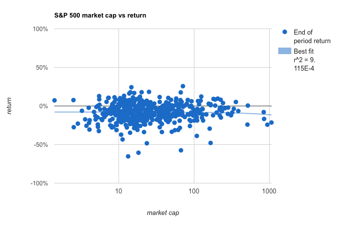
We’ve created a scatter chart plotting returns versus the log of market cap at the start of the period for S&P index members. Taking the returns from the start of the year, there is a small positive relationship between size and return. Taking the returns from the start of September to Thanksgiving, and this relationship becomes modestly negative.
Of course one must be cautious about small statistical effects buried in noisy data. But it chimes with the feeling that the climate is changing for once-charmed mega-cap tech stocks: either because of a regulatory backlash as with Facebook and Google, or the fear that consumer appetite has peaked, as with Apple.

When we plot the cumulative year-to-date returns of the index members, the striking dominance of giants like Apple is tempered compared with a couple of months ago, although you still would do better by holding just the largest four members of the index, stopping at Amazon. Adding the fifth-largest stock at the start of the year, Facebook, would have dragged your return down to 6 per cent. For active funds that track the S&P, the choice between these two stocks as the largest member of their portfolio makes all the difference. For those whose pensions are invested in such funds, these distinctions are worth bearing in mind.
 Levelling the Playing Field
 Barclays and Labour's growth plan
 Plummeting bonds reflect souring UK mood for outsourcing and privatisation
 Dimon rolls trading dice with excess capital
